Product Concept & Design System Exploration
The Quick 16-Hour Design Test
A deep-dive into building a scalable brand and product system under ambiguous constraints. What began as a take-home assignment ended as a full Figma flex - building a brand, design system, and responsive component library for desktop and mobile I'm especially proud of.Task overview
ROLE(S):
UX/UI, Brand, & Systems DesignerTOOLS:
FigmaTIMELINE:
48 hours given (Done in 16) | Friday → Monday AMSCOPE:
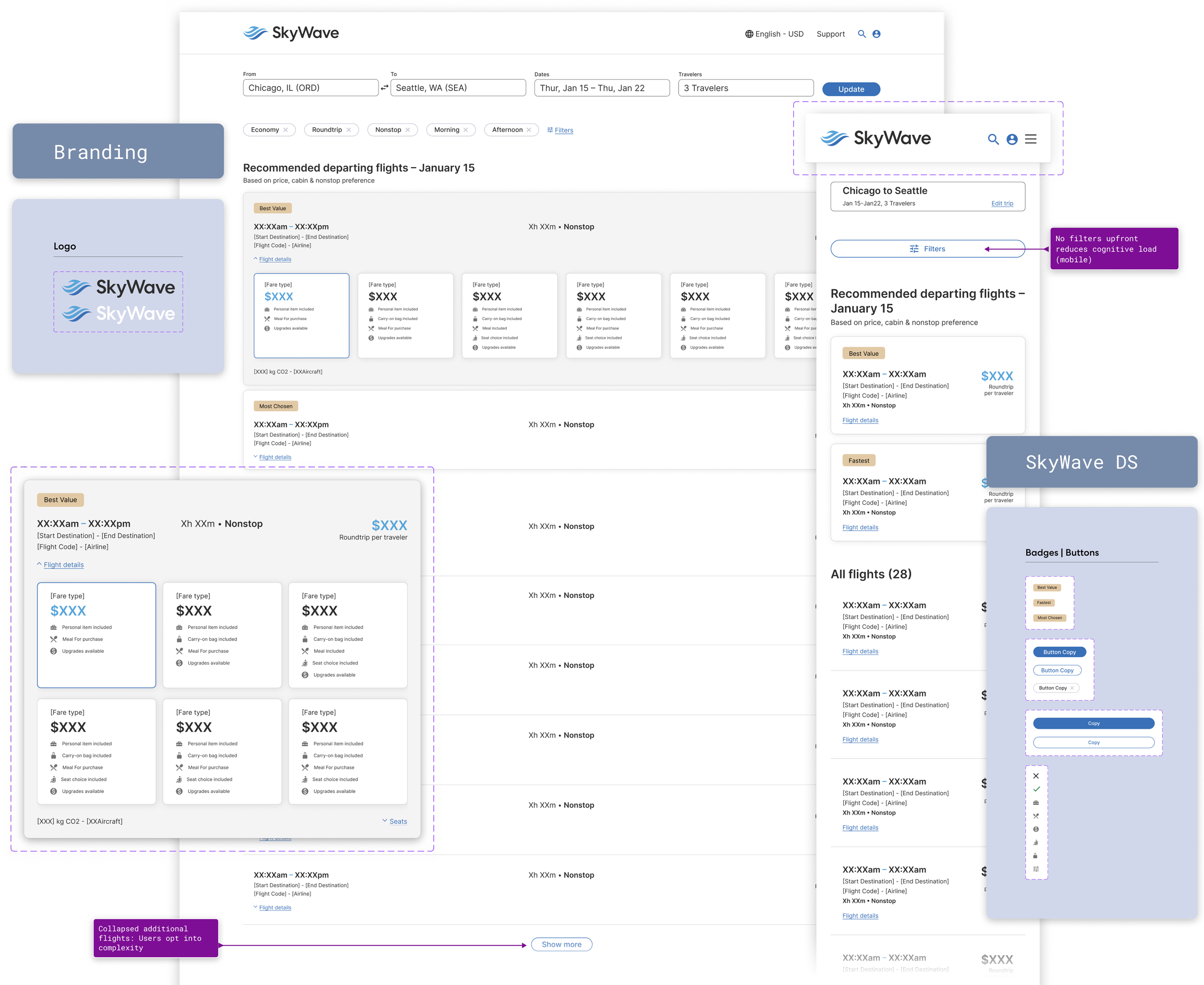
Flight Search Results page redesign handling 30–60 flight options per search with mobile and desktop responsive design.The challenge
Redesign a Flight Search Results (FSR) experience using provided data. The goal was to improve the browsing and decision-making experience for users comparing dozens of possible flights.Provided:
Flight dataProblem framingExpected deliverables: high fidelity wireframes or mockups
Not provided:
Existing product screensBrand guidelinesTypographyUI componentsDesign systemLogo or visual identity
So the brief quickly evolved into something slightly larger than a redesign.The strategy
-
Without an existing UI or design system to reference, I made an early decision:
Rather than designing a single page in isolation, I established a lightweight product system to ensure consistency across states and devices, and to visually communicate my strategy.
This meant defining:
Brand identity (Logo + Wordmark)
Typography hierarchy
Uniformed Spacing
Color usage
Component patterns
Responsive behavior
Was that strictly necessary for the assignment?
Probably not.
Did it make the solution more coherent?
Absolutely.
-
The core problem in flight search results is decision fatigue.
Users aren’t trying to configure a flight immediately.
They’re trying to choose one quickly from dozens of options.So the guiding principle became: Prioritize selection.
This led to three core design decisions:
Emphasize
Price
Number of stops
Departure and arrival times
De-emphasize
Aircraft type
Carbon footprint
Amenity icons
Fare micro-details
Seat selection
Baggage configuration
Defer customization and add-ons until after the user commits to a flight.
Information is progressively revealed as intent increases.
-
When a search returns dozens of flights, visual hierarchy becomes critical.
Each result card emphasizes the information users care about most:
Price
Duration
Stops
Time window
Allowing users to compare options in seconds rather than minutes.
-
Secondary details appear only when relevant:
Expanded card states
Inline details
Post-selection configuration
Reducing cognitive load while preserving access to deeper information.
Mobile & Desktop Systems
The interface was designed responsively from the start. Both versions maintain consistent hierarchy and interaction logic.Desktop
Dense scanning gridParallel comparisonExpanded result systemMobile
Vertical result cardsSticky filter accessSimplified scan patternDesign System
Because no UI foundation was provided, I created a lightweight design system to support the interface. While the assignment did not explicitly require a system, creating one ensured the design could scale beyond a single screen. This included:Foundations
Typography scaleColor paletteSpacing systemIconographyComponents
Global nav barFlight result cardsFilter modulesButtons and actionsInteraction Patterns
Result expansionFilter applicationResponsive layout transitionsOutcome
While this concept was created as part of a design exercise rather than a shipped product, the project demonstrated how quickly a complex, ambiguous prompt can be translated into a structured and scalable interface.Personal success metrics:
Speed to Structured SolutionWorking Comfortably in AmbiguitySystem Thinking Under Time PressureVisual Hierarchy at ScaleClear Design RationaleSuccess metrics for a real implementation might include:
Reduced Search Results AbandonmentFaster Time to Flight SelectionHigher Booking ConversionIncreased Engagement with Recommended FlightsReduced Filter ConfusionReflections
This exercise became an interesting experiment in working under ambiguity and time pressure.In roughly 16 hours, the project evolved from a simple redesign prompt into:A small product systemA responsive interfaceA full component libraryA polished design presentation
While real-world product work would normally involve research, iteration, and collaboration, this exercise demonstrated something equally valuable: the ability to move quickly from ambiguity to a structured, scalable design solution.Key Takeaways
Strong visual hierarchy is essential when presenting large sets of comparable data.A lightweight system often emerges naturally when designing complex interfaces.Constraints — or lack thereof — can reveal a designer’s natural instincts.And sometimes a “quick” design test becomes an opportunity to build something bigger. Despite the outcome.
What I’d Do Next With More Time
Explore Edge Cases, Define Accessibility & Inclusivity, Add Motion, Reallocate time to storytelling vs. pixels. (this one is tough for visual designers) Lessons From a 16-Hour Design Test
Ambiguity can be inspiring.Systems appear quickly when solving real problems.Flight search is a masterclass in information density.“4–6 focus hours” is a wonderfully optimistic unit of measurement.UI Design, Branding, and Building Design Systems are my strengths.Providing more ≠ 'winning' concept. Do what's needed really well, everything else is bonus.There is always something positive to gain if you give 110%, even if the outcome is't what you expected.